


Use Tableau to answer questions regarding your business
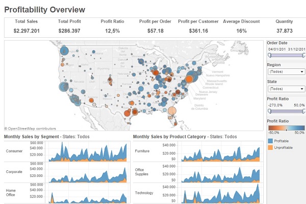 Tableau is a Business Intelligence solution that allows users to understand, in a visual and intuitive manner, what is happening in our company. This is why it has been considered the best in the Gartner Magic Quadrant. This saves the company a lot of time and enables us to reach conclusions much more quickly than used to be the case. Tableau enables you to go from the more general to the more specific and be aware of what is happening in certain departments. Let’s use a specific example to explain this:
Let’s imagine that a sales manager from a gardening and DIY company has to submit a report to the company’s executives on the sales of a given product; let’s say electric saws, due to a sharp increase or decrease in sales. With Tableau, he will be able to tell the story in a visual manner and, therefore, much easier for the executives to make decisions in a coordinated manner and respond to relevant situations.
- After accessing Tableau Desktop, the first step would be to connect to the database, which can be from the server, which includes many native connectors, or from a file. It is time to start generating the dashboard.
- Having selected the database (which we can cross-reference with others if we wish to do so), we only have to drag them to the database connection screen, which will be blank at present. This is possible thanks to Tableau Software’s intuitive technology and innovative drag and drop feature.
- Now, we have a database with several columns that refer to a range of fields that we can filter, delete, change the name… based on our needs.
- We can now work with these data on our work-sheet and transform them into a much more visual presentation, by choosing a chart, to be able to respond to our questions. In this case, we want to know the evolution of electric saw sales, which we shall select by applying the filters we need to obtain in-depth information and understand why there has been a change in sales figures: We can apply a wide range of filters:
- Sales per month, quarter, week and even per second?
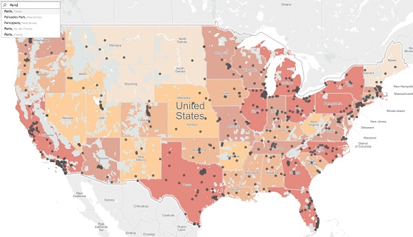
- Where we are suffering losses, i.e. where fewer saws are being sold? We can use smart Maps for this purpose: If I want to obtain the sales figures in certain cities, I can create a map on my dashboard that displays this in a more visual manner. In fact, in Tableau’s new version, 9.0, smart maps have been improved, making them easier to use and the answers to geographical queries (even to the level of streets where sales are made) are obtained more easily. This enables us to take steps to improve sales.
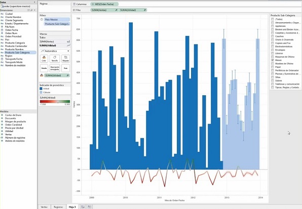
- Predictions: How many saws shall we sell over the next few months? In order to answer this question, Tableau Software offers the possibility of making sales forecasts, as can be seen in this image: sales to date in dark blue, forecasts for future years in light blue.
This is only an example, but Tableau can configure your dashboard by capturing key information, applying filters and highlighting the necessary information to respond to all the queries you may have. In short, following a logical process, you can prepare a compelling narrative based on data in which the team can participate and contribute their vision to improve the results.
Once you have generated the dashboard, you can share it on Tableau Server so that the people who have access can work on it and make comments until you reach the necessary conclusions.
Intelligence Partner offers you the possibility of implementing Tableau in Google Cloud, which guarantees unparalleled scalability, availability and accessibility levels for your company. You can try Tableau for free. Contact us and start processing data with a great Business Intelligence tool.
