


SugarCRM: usability in detail
 SugarCRM is one of the top players in the CRM market for several reasons. One of the most important is the level of usability of its interface, which focusses on the needs of the end user and is based on an innovative technology already being used by more than one and a half million people around the world.
Companies usually work with highly compartmentalised solutions to the point that interaction between them is limited. This delays and blurs the possibility of achieving an overall view of what we understand as the customer life cycle. SugarCRM intends to do away with the idea of placing information in isolated silos incapable of communicating with each other. Instead, it promotes cooperation through technology and by involving the marketing, sales and customer departments. All this sounds good, how do you do this in the real world?
SugarCRM has the most modern interface in the CRM market and it is characterized by feeling of tidiness and sharpness; also on its version for mobile devices, to which it has been adapted.
If we access SugarCRM as a sales department user, the first thing we shall encounter is a display featuring several elements:
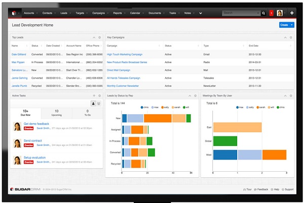
The top bar
Consisting of several tabs, which allow quick access to the various modules to which a given user has access: accounts, contacts, opportunities, budget, tasks… Users can configure the order in which they appear and those that are visible at start-up, within all the modules to which they have access.
In addition, there is a predictive search bar that enables us to obtain results without wasting time in locating where we have saved them. Then, there are notifications, which are colour-coded, based on their priority and the user’s profile. You can configure everything related to your account.
Finally, there is a quick creation guide. It opens a form in which we can create a contact, an environment, an appointment, an account, an e-mail… and link it to any of the modules that we work with.
Control panel or dashboard
As in the case of the bar, it is configured by default through the administrator. However, SugarCRM, unlike other solutions, enables users to configure or create a new one with the information required to organise daily tasks at a glance.
Users can add their diaries, accounts that they have not used in recent days, contacts, pipeline, top ten revenue, forecasts, records of meetings, analyses, reports… to the dashboard by simply dragging each element.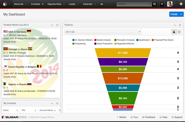
Another key feature of SugarCRM is its list of recent activities, included on the dashboard. This is a tool that several users can access to collaborate; it provides detailed information on activities related to the accounts users are working on.
It provides information on what has been done recently: who has created entries or new tasks, communicate with other members of the salesforce through private chats or send comments. This possibility exists in all the modules.
The modules
Once you access a module (from the top bar), you will see that the screen divides into two parts:
- The main part is on the left, which includes the module list view or the details of an item you have selected.
- The businesses intelligence panel displays the dashboards with relevant information (activities related to that module, global status of an account…) and the workflow related to the said item. This workflow summarises all the actions performed in relation to the item: changes, creation, chats…
If, for example, you deploy the menu of one of the modules; let’s say “accounts”, you will see shortcuts:
- Quick account set-up.
- Access to the list of all accounts.
- Access to reports on accounts.
- Favourite accounts and recently viewed accounts.
The view that lists all of the module’s items also includes a series of usability enhancements that allow users to browse quickly through the list without having to open each one of the items to see if it is the one they were looking for.
These enhancements are: preview of the main item data on the right-hand side of the screen, searches, add to favourites, change, monitor to prepare a report of the actions performed in relation to the item, merge items (to merge duplicate accounts).
This provides a 360 degree view on a single screen.
In short, SugarCRM allows us to distinguish three types of panels that enhance usability, that facilitate a 360 degree view of a customer based on a philosophy that focusses on individuals:
- Context panels: Contact introduction tabs and information related to the contact: opportunities, incidents, campaigns…
- Collaboration panels: These panels make it possible to see other users and to share and communicate with them regarding relevant aspects, work with real time updates and see system event notifications.
- Intelligence panels: These add relevant context data through internal systems, such as accounting or supply chain, and through external systems, including Twitter, Facebook or Websites. They can be customised based on users’ roles, alarms can be activated and they can be prioritised in real time.
This level of usability, coupled with transparency in terms of costs, flexibility regarding integration and the fact of being the market leader among all manufacturers that are solely dedicated to CRM solutions, makes SugarCRM in an excellent choice.
If you should need more information on how to start, you can contact Intelligence Partner. We are experts in implementing CRM solutions
